
B2B Design Rule: Read the Content Before You Design (AI can help)
Read First. Design Better.
In design, there’s a common mistake: starting with layout before understanding the content. It’s tempting to jump straight into grids, fonts, and colors—but in B2B, that approach rarely works. The content is often complex, technical, or compliance-heavy. If you don’t take the time to read it, you won’t be able to simplify it for your audience.

Image generated with MidJourneyV7
Graphic designer reading content on an ipad and taking notes. Location is the desert with blue skies. She is excited.
Why Reading First Matters in B2B
B2B content isn’t like consumer advertising. You’re not distilling one emotional hook into a single campaign. You’re often translating pages of technical material, product details, or regulations into something people can actually use.
If you don’t read and understand the material, your design risks being decorative rather than functional. The role of design in B2B is to guide—making complex information accessible, scannable, and engaging. That starts by knowing what’s important in the content itself.
My Tip? Steal From Editorial Layouts
When in doubt, look at how magazines handle content. Editorial layouts are built for readability and engagement, and many of the same rules apply to B2B design. A few basics I always lean on:
Hierarchy is everything. Headlines, subheads, and pull quotes create a natural reading flow.
White space works. Don’t cram the page—give the eye places to rest.
Chunk the content. Break dense text into smaller sections, lists, or sidebars.
Visuals should clarify. Use charts, icons, and images to explain—not just decorate.
Balance consistency and variety. Keep brand elements steady, but vary layouts enough to stay fresh.
Think pacing. Just like a magazine feature, not every page (or slide) has to carry the same weight. Some should be bold and attention-grabbing, others quieter and supportive.
These rules are simple, but when applied in B2B, they can transform heavy content into something approachable and engaging.

How Editorial Thinking Helps
This is where editorial design comes in. Think like a magazine designer: hierarchy, pacing, white space, and flow. Every visual choice should help the reader process information in the right order.
When I worked on Venminder’s compliance reports, I treated them like editorial spreads instead of static whitepapers. Long paragraphs became digestible layouts with clear sections, pull quotes, and data callouts. Suddenly, information that felt overwhelming became approachable and useful.
For Venmonitor, the SaaS product launch, I used editorial principles to design onboarding guides and product overviews. Instead of feature dumps, we created structured layouts with step-by-step visuals, icons, and modular sections. This let new users scan quickly while still absorbing critical details.
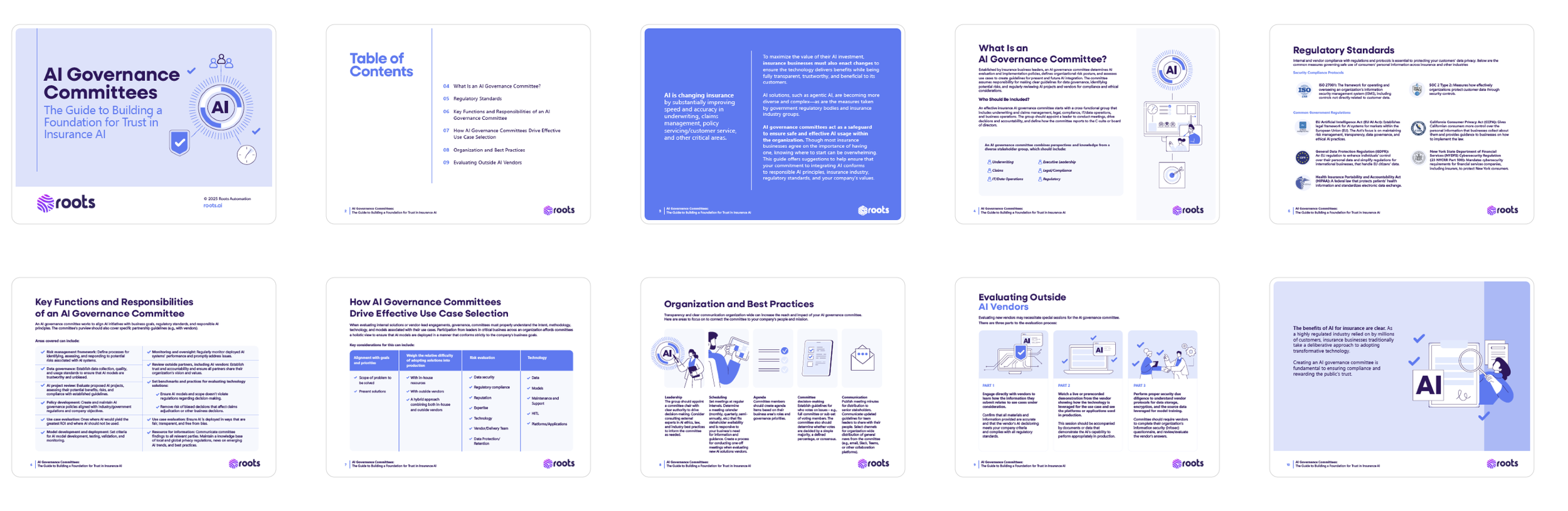
At Roots AI, I applied the same thinking to short-form thought leadership. A lengthy AI whitepaper became a series of modular layouts—bite-sized infographics for LinkedIn, motion snippets for campaigns, and condensed eBooks. By breaking down content, we kept the core ideas intact while making them digestible across multiple formats.
More examples of my B2B editorial style work here.
Rules I Design By
My Principles for Editorial-Heavy B2B Projects
When approaching editorial-heavy B2B projects, I follow a few key principles:
Read the content first. Highlight what matters. Mark what can be trimmed. Sometimes I even print it out (yes, I still have a printer!) — two pages per sheet with wide margins for notes. That lets me read away from the screen and start mapping out hierarchy with a pen in hand. Other times, I’ll read on an iPad and annotate directly. When time doesn’t allow for either, I’ll copy the text into a working doc and add notes there. The point is: you need some system that helps you start breaking content down before design begins.
Create a clear hierarchy. Use headings, subheads, and visuals to guide the eye. Set up paragraph and character styles in your design program so they’re consistent throughout the document. I set up styles even for short projects—consistency matters at every length.
Chunk the information. Break long paragraphs into smaller, scannable sections. By getting familiar with the content first, you’ll know where natural breaks should be. Don’t be afraid to experiment in the first draft—stakeholders will review and provide feedback. The key is to present the content in a way that feels approachable instead of overwhelming.
Use visuals to clarify, not decorate. Charts, icons, and infographics should always explain, not just fill space. Don’t add an illustration just for the sake of it—it needs to connect to the story. If someone reads the text first, the visual should reinforce it. If they see the visual first, it should still make sense before they read. And if they never read the text at all? Then the visual alone has to carry the message. That’s how important these elements are.
Respect the brand. Editorial design doesn’t mean ignoring guardrails—it means pushing them in service of clarity. Sometimes that means expanding the palette with flexible, modular branding so designers have more to work with. Other times, it means tightening the options to create sharper consistency. Either way, the goal is the same: give the team enough structure to stay on-brand, but enough freedom to make the material engaging.
From Stylist to Translator
Designers aren’t just stylists. In B2B, we’re translators. Our job is to take dense, complicated information and turn it into something people want to read—and more importantly, something they can actually understand.
That work doesn’t start in Illustrator or InDesign. It starts with the content. By reading first, we give ourselves the tools to identify hierarchy, decide what can be simplified, and choose where visuals will truly add clarity.
Skipping that step may feel faster in the moment, but it almost always creates more confusion down the line. When we design without really knowing the content, we’re designing for ourselves—not for the audience. And in B2B, where clarity is everything, that’s a mistake teams can’t afford.
Good design doesn’t just decorate—it communicates. And communication starts with reading.
When AI Can Help
Sometimes deadlines don’t give you the luxury of printing pages, highlighting passages, or carefully marking hierarchy. This is where AI can step in as a support tool. An AI assistant can quickly summarize long-form content, highlight key themes, or even extract bullet points to get you oriented fast.
The key is to use this as a starting point—not a replacement for actually reading. Summaries help you spot what deserves deeper attention, but the designer’s eye still needs to verify tone, nuance, and priority.
⚠️ Important: Always make sure you’re using an organization-approved AI tool that protects client and company information. Content in B2B often contains sensitive data, so security and compliance should come before speed.