SAAS SOFTWARE / DESIGN SYSTEM / UI / UX
Building a Scalable Design System for a Suite of Risk Management Tools
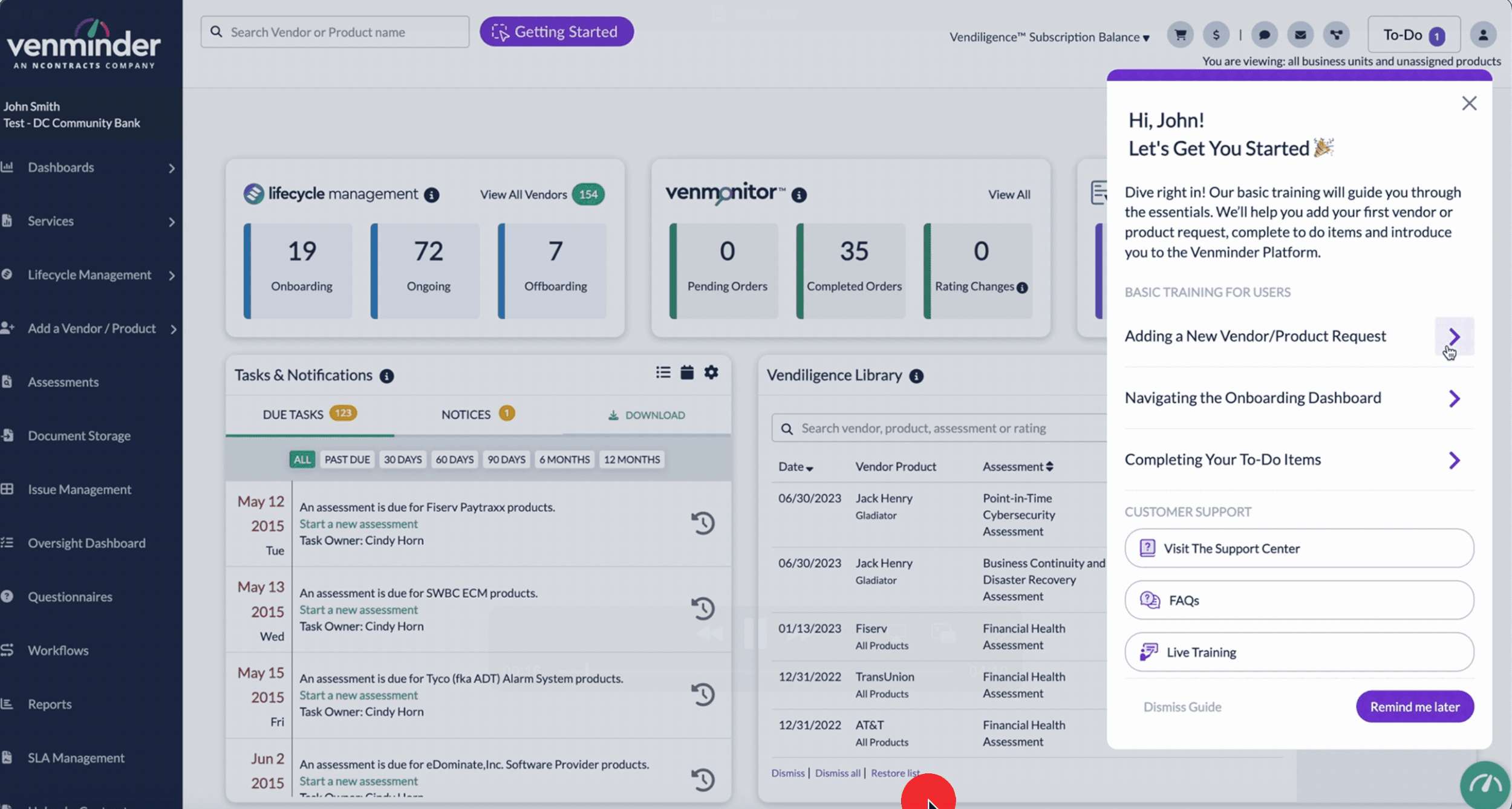
As Venminder’s product suite expanded—from its core TPRM software to standalone tools like Venmonitor and Vendiligence—a unified design approach became essential. I led the creation of Venminder’s first comprehensive design system, establishing a visual and functional foundation that powered the UI for all three products.
-
Led the initial research, strategy, and development of Venminder’s first unified design system
Designed the UI/UX for Venminder TPRM Software, Venmonitor, and Vendiligence
Built accessible, modern interfaces to visualize complex risk data
Maintained brand alignment while evolving the user experience across separate tools
-
Figma, Adobe XD, Miro, Zeroheight
-
A strong design system scales across products
Risk software can be clear, modern, and user-friendly
Visual consistency builds user trust in data-heavy tools
Design System Strategy
Objectives:
Create a scalable design language for a growing risk management product suite
Improve accessibility and UI clarity across distinct user journeys
Streamline design and development workflows with reusable components
What I Created:
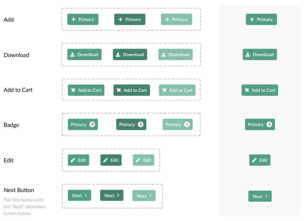
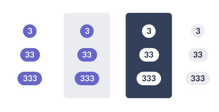
Component library: Buttons, forms, tables, filters, badges, and modals
Grid & layout structure: Responsive spacing, card systems, dashboard templates
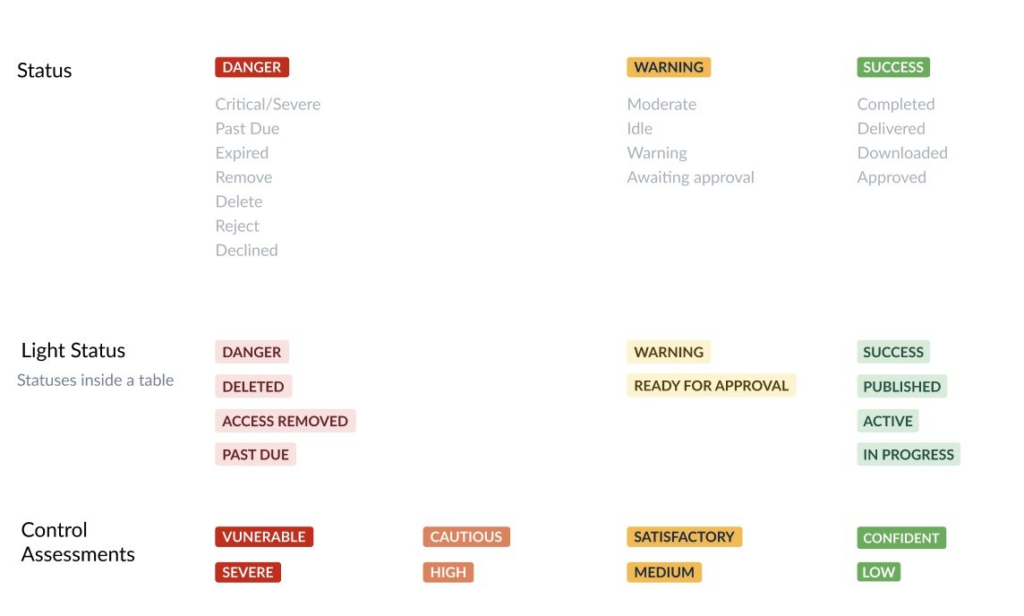
Color system: Contrast-compliant and modernized for visual hierarchy
Iconography & typography: Custom sets for clarity and compliance
Usage documentation: Guidelines to support scalability and cross-team alignment


Product Applications
The foundation of the platform, this tool supports vendor onboarding, contract management, and ongoing due diligence. I redesigned the UI for cleaner workflows, reducing user friction across high-volume tasks. Visual clarity and modular layouts helped streamline complex compliance processes.
Vendor Lifecycle UI – onboarding, active, inactive, offboarding states with clear visual transitions
Empty States – guided layouts with helpful CTAs for onboarding and data gaps
Risk Rating Visuals – scalable, color-coded meters and badges for custom risk tiers
Alerts & Escalations – persistent banners, modals, and inline warnings for critical actions
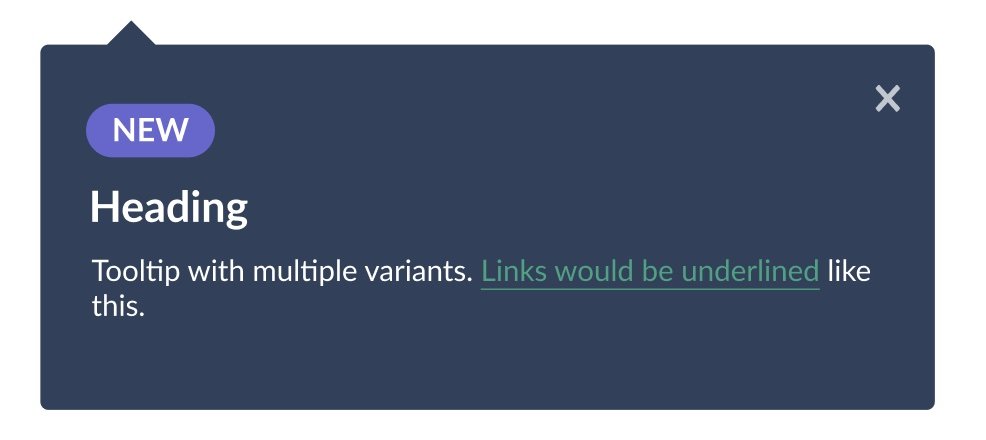
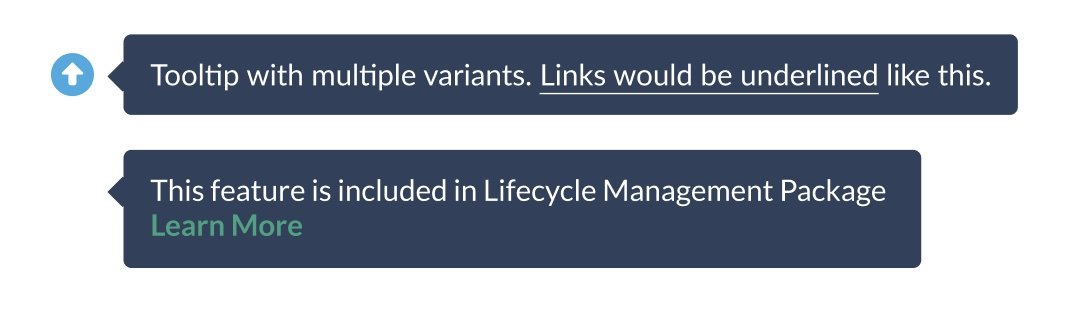
Contextual Tooltips – microcopy and help icons to support complex workflows
Role-Based Actions – dynamic buttons and side panels based on user permissions
Filtering & Tagging – smart filters by risk, status, industry, and more
Reusable Components – unified design system across Venminder, Venmonitor, and Vendiligence

Venminder TPRM Software


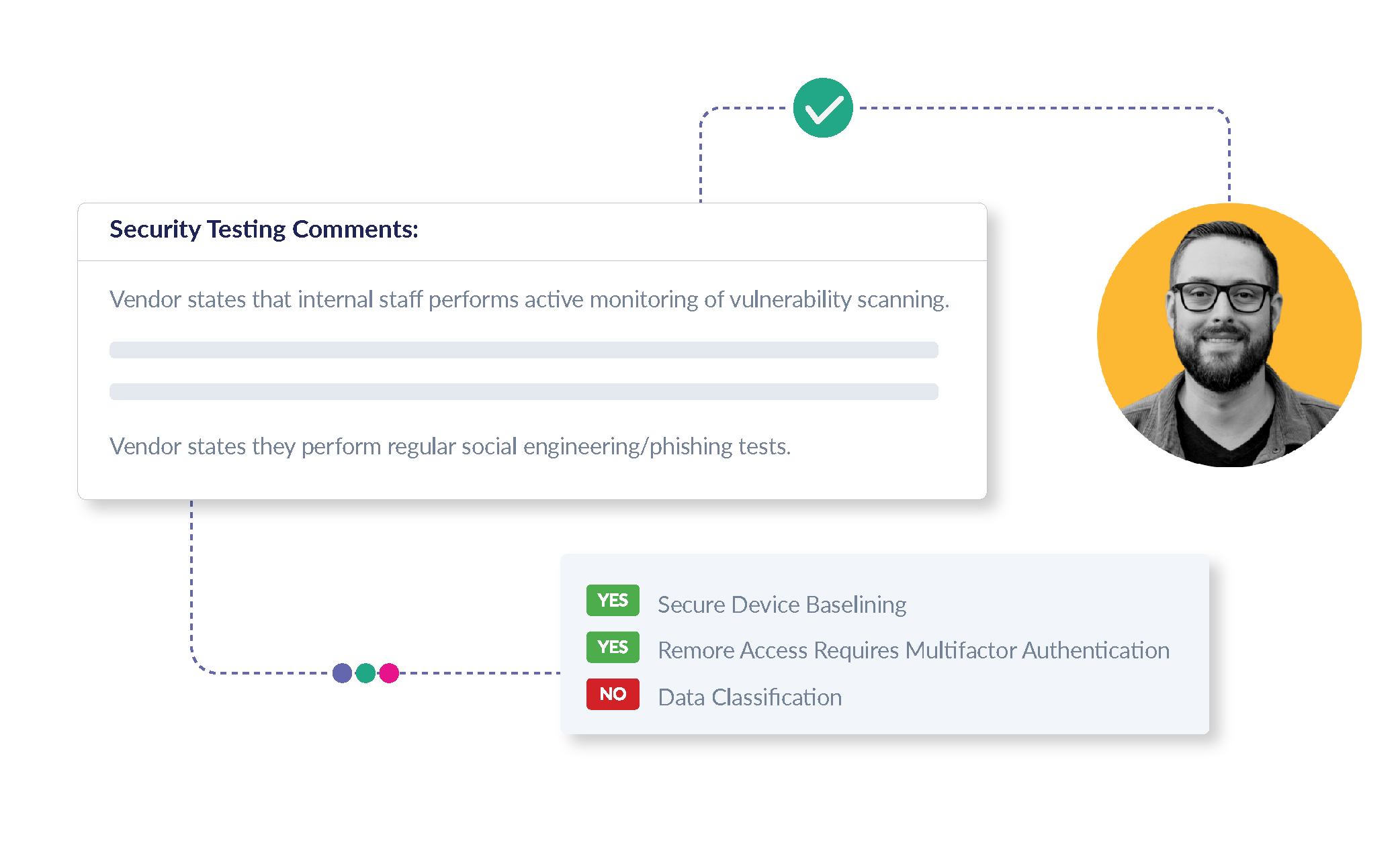
A standalone tool for continuous vendor risk monitoring. I applied the design system to create an intuitive dashboard with visual risk indicators, trend graphs, and simplified data tables—allowing users to absorb key insights at a glance.
Standardized Risk Ratings – unified visuals across 12+ data providers
Color-Coded Badges – consistent scales for easy scanning
Daily Refresh UI – real-time updates with visual change indicators
Normalized Data Views – simplified, side-by-side comparisons
Custom Widgets – modular design for provider-specific insights
Tooltips & Hovers – context for scores, definitions, and sources
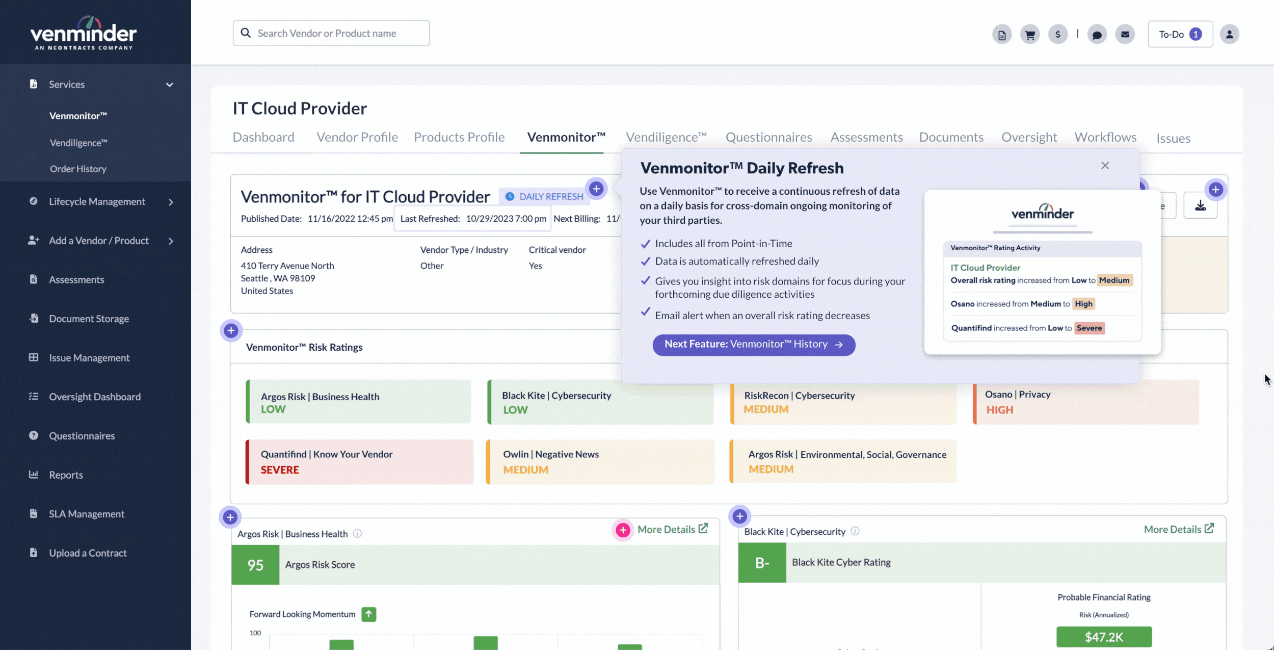
Venmonitor


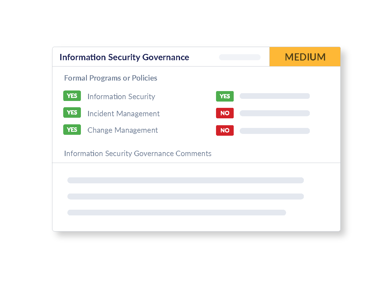
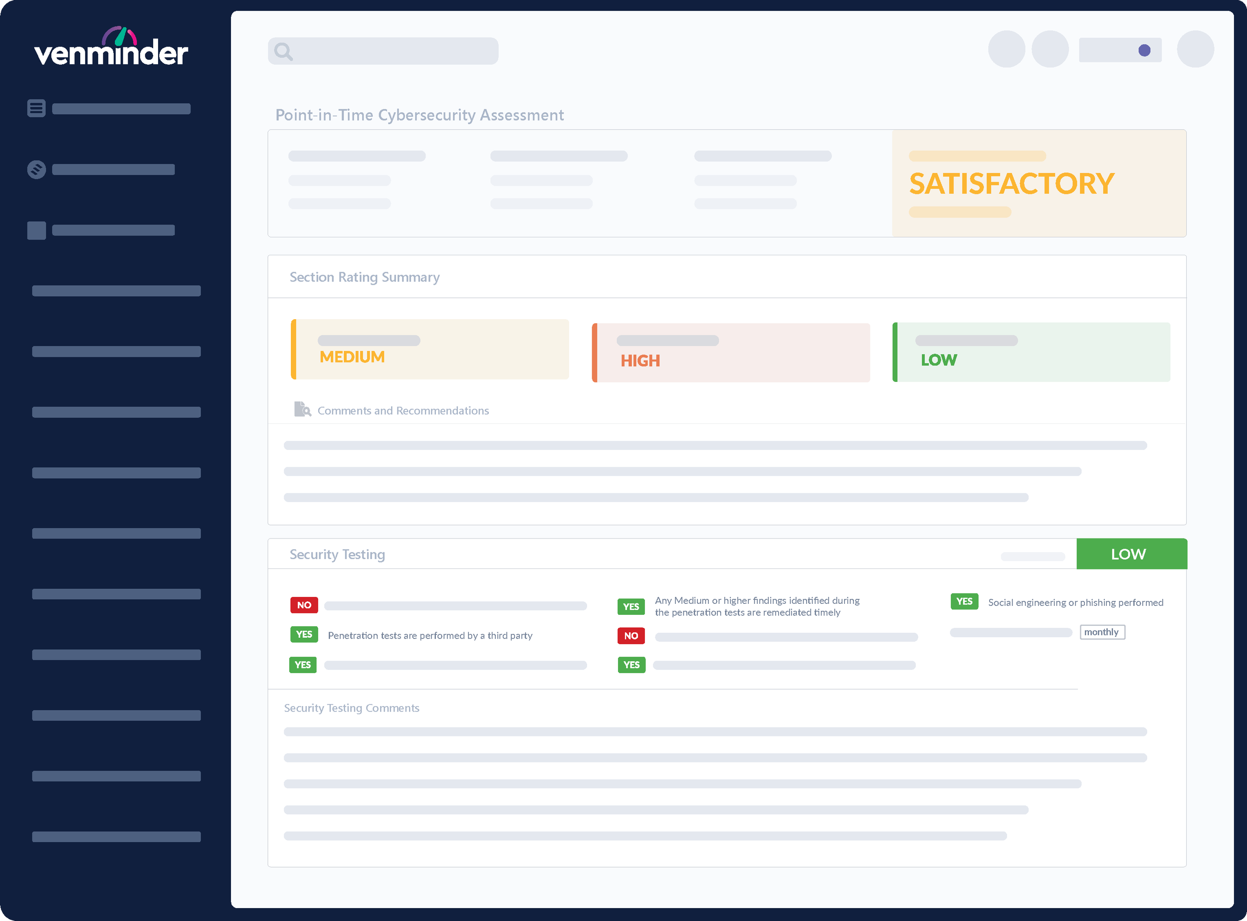
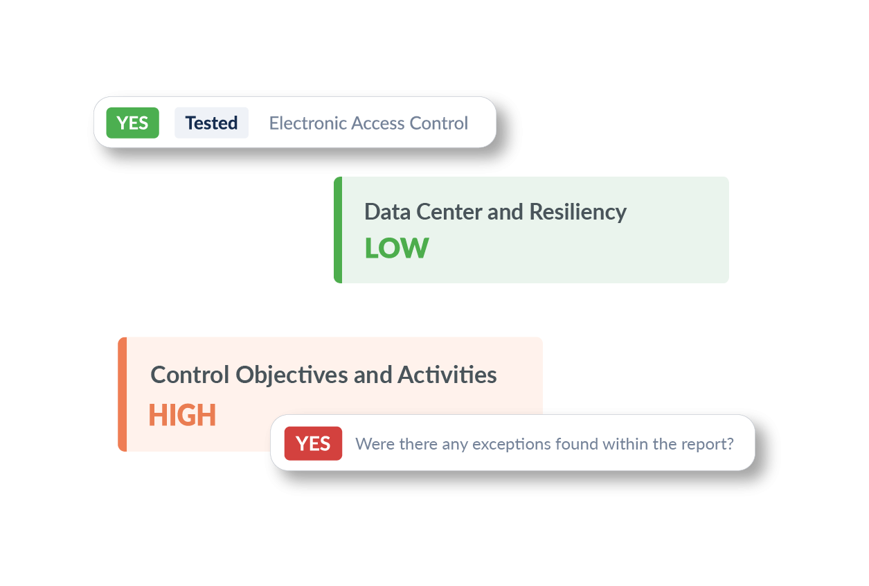
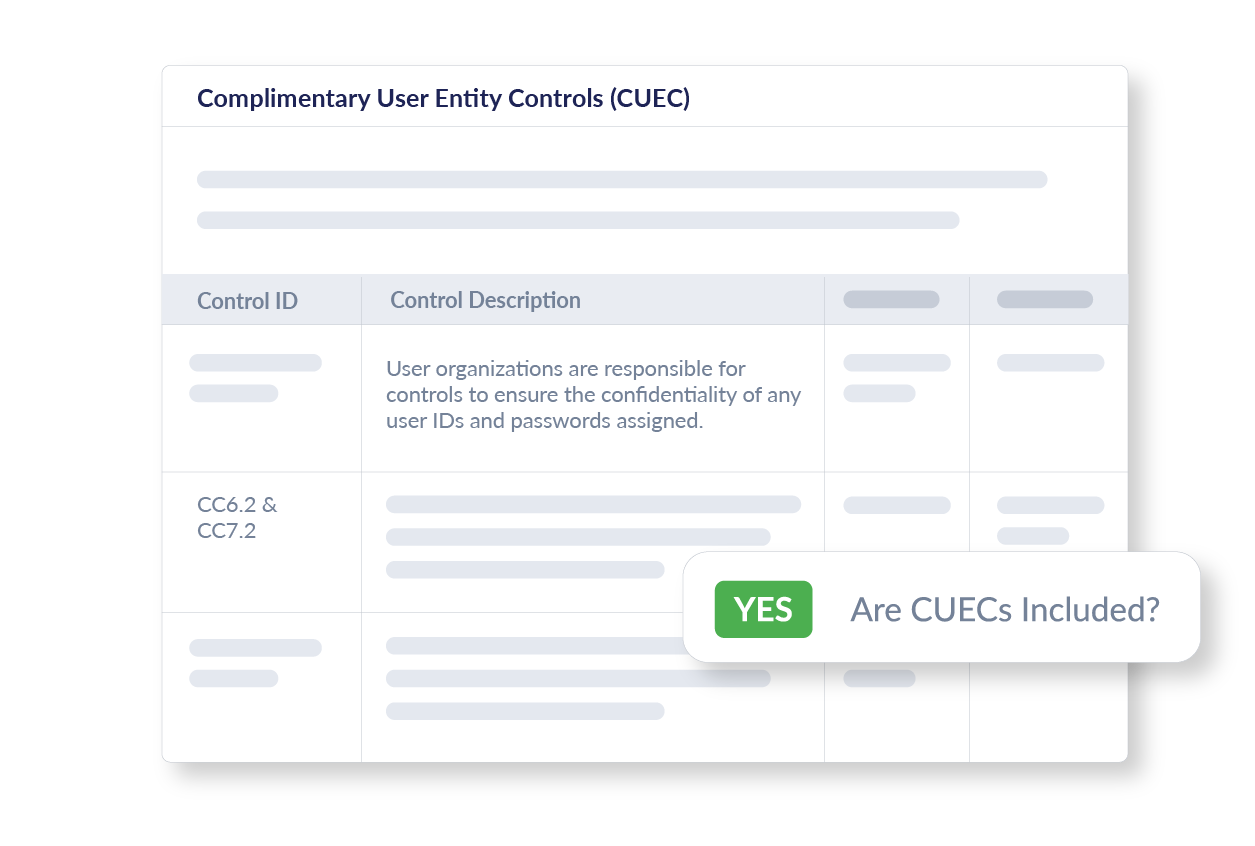
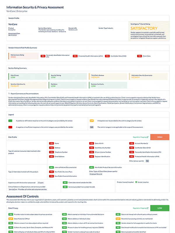
Focused on vendor control assessments, Vendiligence required a task-oriented UI. I designed collapsible sections, progress indicators, and flexible forms that guided users through multi-step evaluations without overwhelming them.
TOP UX/UI Elements for Vendiligence
Risk factor scoring widgets to rate vendor controls (e.g. 1–5 scale, color-coded)
Custom dropdowns and toggles for control selections and compliance responses
Visual risk ratings using color-coded badges and icons (e.g. low, medium, high risk)
Expandable sections for each risk domain or control category
Progress tracking bars to show completion at the assessment and section level
Interactive tables for tracking evidence, due dates, and assigned owners
Contextual tooltips to explain regulatory requirements or rating guidelines
Summary dashboards that compile overall vendor risk posture

Vendiligence


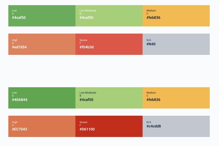
To ensure clarity and consistency across Venminder’s product suite, I developed a standardized set of rating colors that were both WCAG AA contrast compliant and adaptable to various rating scales. Whether applied to a simple 3-tier risk model or a detailed 10-point partner-specific scale, the color system remained accessible, intuitive, and visually aligned across TPRM Software, Venmonitor, and Vendiligence—supporting both out-of-the-box and custom configurations.

Unified Rating Colors for Scalable Risk Visualization


Explore my work at Venminder—from branding to product design, engagement, and support.
-
![]()
SaaS B2B Branding
Led the creative direction to define Venminder’s brand across all touchpoints, positioning it as a top TPRM solution.
-
![]()
Revamping SaaS Design System
Built and scaled a cohesive design system used across Venminder, Venmonitor, and Vendiligence for UI/UX consistency.
-
![]()
Venmonitor GTM Website
Designed and launched the go-to-market site with clear messaging, clean UX, and explainer videos to drive conversions.
-
![]()
SaaS User Support
Redesigned the support center, adding tutorials, live training, and smarter in-app help to reduce tickets and improve self-serve.
-
![]()
Fun B2B brand with Venmonsters
Expanded the brand with a playful mascot campaign to boost engagement and bring personality to compliance.
-
![]()
SaaS Product Engagement
Drove adoption of new features and modules with in-app guides, onboarding flows, and targeted comms.
-
![]()
SaaS Risk Monitor Product Design
Led UI/UX for Venmonitor, simplifying complex data into intuitive dashboards and risk visualizations.